Tips for Designing a Perfect WordPress eCommerce Website
The entire prospect of building a WordPress eCommerce site can be quite intimidating, irrespective of whether you’re a beginner or a professional already. If you communicate with people around or research a bit deeper on the internet, you’re sure to come across dwindling thoughts and unclear statements.
The primary reason behind this would be that every other person comes with an individual theory when it comes to designing an online store. Of course, the struggle to balance the navigation and appearance is quite real and tough too.
One of the best parts about designing an e-store would be concentrating on data and case studies. Although inspirational expression and creativity always help you achieve the best; however, with data-driven suggestions, you can seamlessly gain more benefits.
With an eCommerce store, your primary objective would be to sell more of what your company offers, right? But, if you haven’t paid attention to the design element much, achieving this objective might seem far away thing.
Having said that, here are some of the substantial tips that will help you design an attractive online store effortlessly. Let’s dig deeper.
Also read:
- How to Build Your Own Custom WordPress Theme? Here is the Starting Point [Video Tutorial]
- Here is What I Have Learned with My Recent WordPress Project
Tips to Design a Perfect WordPress eCommerce Site
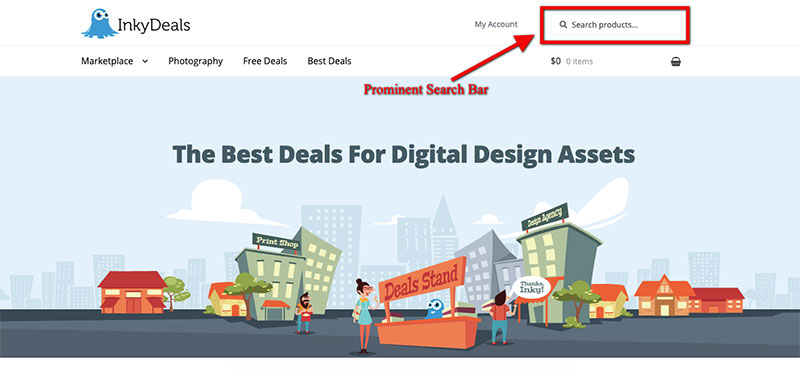
Search Bar Should Be Easy to Find
If your online store supports an extensive range of products, you’d have to keep in mind that your customers aren’t going to navigate through each and every product or page to find out what exactly they’re looking for.
Image Source: https://www.inkydeals.com
In such a scenario, you’d have to make sure that you’re making the search part easier for them. To do so, having a visible search bar that can be accessed by anyone instantly would help you incredibly. You might want to consider ignoring the mini search features for homepage or landing page.
Instead, choose a prominent search box that’d get displayed on the front and the center so that it’s easy to discover and use. If you visit any of the well-known portals, you’ll find a wide search bar showcased at the top. Use this strategy to get more engagement.
WordPress eCommerce Site Design
Even though you’re building a platform online, one thing that you must not forget is that it’s the overall experience that’s going to attract potential leads and increase your conversion rate. Having said that, you’d have to pay careful attention to how you arrange products.
Anything that looks too messy or chaotic is going to turn off your visitors. For an e-commerce store, there’s always a pristine way to display the products available in the inventory. Make sure that your products are segregated in relevant categories.
You can also use the grid layout to keep the store tidy and neat. Also, ensure that each of your products come with a precise description that gives away what exactly your customers are going to get if they buy it. And then, label them with the correct and transparent price tag.
Express A Story
Efficient products always come with a great story behind. It’s too easy for almost every other person to develop an eCommerce website, launch it online, and start selling whatever they wish. However, not every other person can create a successful brand image concerning their products.
Your proficiency in communicating a convincing story about the brand will help you develop a stronger brand image. Not just that, storytelling also nurtures loyalty. Your customers tend to remember your brand if they feel a personal and sincere connection with it.
And, the best way to do so would be by mentioning the same on your eCommerce store. Talk about:
- Why did you create the products that you’re selling?
- How can your products help increase efficiency for users?
- What’s your vision?
- Who are your target audiences?
You can create an individual page to answer all of these questions through hooking graphics and compelling words. Make your customers feel at home.
SEO-Optimized Titles & Names
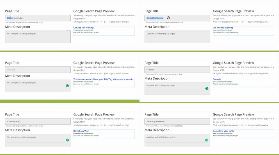
When you think of a title, brainstorm upon something that your target audience is most likely to search for. It will help your store rank higher on widely-used search engines, like Google, and more. This, in turn, will generate more sales for you.
Image Source: https://www.lawton.digital/project/seo-consulting-case-study-new-website/
To make your task easier, there are innumerable premium WordPress plugins that you can find to fulfill varied requirements in terms of search engine optimization. By including focal keywords and other essential data for every product, you can use these plugins to design the store in such a way that all of the pages appear differently on search engines.
All you’d have to do is discover an adequate plugin, install it on your WooCommerce store, activate it, and begin using. It’s as simple as that. If you wish to make some alterations, every plugin allows you to do so without any significant hassles. Therefore, the road of optimizing titles and names is going to be smooth.
Draw Attention Towards Product Scarcity
Running an eCommerce store calls for paying attention to every little aspect of your target audience. One of the most important things that you shouldn’t be missing is their behavior. Based on how they’d react to certain situations, you should take such an action that would put you under the rock of profit.
Although there are several strategies and techniques that can help you do so; however, a vital one would be highlighting the scarcity of products. There are chances that your visitors might have landed on your site just to go through your products.
As and how their behavior would be, they might put products in the cart and don’t buy it. Or, they might save the purchase for later. In such a situation, if you’re creating urgency by letting them know how many products are left in stock, they wouldn’t delay the purchase anymore. With this simple technique, you can surely create a substantial difference in your conversion rate.
Also read: Anatomy of a Killer Website That Can Flood You with Sales
Make Use of View Cart Button
You must have noticed that almost every other online store showcases a shopping cart icon somewhere on the page, precisely at the top right corner. This one icon assists consumers when it comes to viewing items that they’d added to the cart. Believe it or not, that’s one of the most important strategies that you can execute.
Image Source: https://abilitybusiness.com/home/shopping-cart/
It’s been proven that making this icon visible all the time can help increase the conversion rate. However, make sure that the icon you’re using is distinct and recognizable, like a shopping bag or a shopping cart. Anyhow, the last thing that you’d want would be to confuse your potential customers, isn’t it?
Also, it’s recommended that you make this button stand out, considering the importance that it beholds. You can use bright colors, different from the background and the ones used for other elements on the website.
Less Emphasize on the Newsletter
Think about it. If a customer visits your store and would only take one action. What would you want that to be? Would you want the customer to purchase something or to sign up for your newsletter, which they’re eventually going to mark as spam or delete?
Obviously, the former one would be your choice, right? Having said that, depending on your objective, you must be re-evaluating the position to display the call to action button for newsletter sign up. You must never let this CTA button distract customers from completing their shopping.
If you’ve displayed it anywhere in the middle or at the top, it’s recommended to move it towards the footer section. And then, you can add an exit intent popup there so as to obtain their email addresses whenever they’re about to leave your website.
Colors Meant to Stimulate Emotions
Even long before the world had encountered this digital revolution, colors have been impacting the business sales on the psychological front. Therefore, by understanding the kinds of emotion that colors can stimulate, you can easily design your store to complement specific vibes and feelings.
According to research, your customers are going to take roughly 90 seconds to decide whether to buy your products or not. And, a massive amount of this interaction period, approximately 70% of it, is based on the exclusivity of colors used on the store.
While deciding upon the colors to use, target audience and product types play an essential role. For instance, if you’re selling products related to the environment, you can use more of the green color to promote the love for nature.
Taking Care of the Loading Time
Believing what Kissmetrics has to say, even a single minute of delay in loading of the store can result in a 7% decrease in the conversion rate. That simply makes it clear how important is speed for your success. Don’t fret upon it as there are several ways to keep the loading time under the benchmark.
Image Source: https://www.jalapenocreative.com.au/blog/website-speed-optimisation
To begin with, you can find mobile friendly WordPress ecommerce themes that wouldn’t let your store lag whenever somebody accesses it on a mobile device, be it a smartphone or a tablet. And then, you can also optimize your images and caching to keep the speed optimum.
And then, choose an adequate hosting management system as well as a content delivery network that’d make the entire process easier for you.
The Bottom Line to Create WordPress E-commerce Website
Bad design and poor shopping experience can distance customers, decrease sales, and harm the brand image. However, with a great design, through engineering, and smart strategy, you can ensure a fast and easy purchasing experience for your consumers.
As a result, you’d receive fewer returns, decreased support inquiries, and more satisfied customers. This simply means more sales and a more substantial profit. That’s what best WordPress e-commerce sites want, right?
Additional Resource
My friend – Dalton West who is a content marketing specialist has come up with an infographic on E-Commerce best practices, check it out here.
Author: Rohit
Rohit is a Digital Marketer by profession and a travel enthusiast by passion. He loves to stay updated with the latest upcoming technology. Professionally he works with CyberChimps and Wpeka to come up with Digital Marketing strategies to help them deliver the best WordPress Products.


