Check Your Website Responsiveness Right From WordPress [WordPress 4.5]
WordPress 4.5 “Coleman” has arrived with many new features and bug fixes. Live Responsive Preview is one of the new features that shows the preview of your website on mobile, tablet and desktop screen sizes. Now you don’t need any third party tool or inspect element to check the responsiveness of your website, you can do it right from the wordpress customizer. Here is how to check the responsiveness of your website in wordpress customizer.
We recommend our free online tool Multi Device Website Mockup Generator to mockup your website on Apple devices including iMac, iPad and iPhone.
Also read:
- 5 Free Mockup Tools to Display Your Template on Different Devices
- Elegant Subscription Popup WordPress Plugin
How to Check the Responsiveness of your Website in WordPress Customizer
- First of all update your website to wordpress 4.5
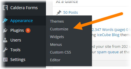
- Click on “Appearance > Customize” menu from the dashboard
- Your website will be loaded in the customizer
- You can see desktop. Tablet and mobile icons at the bottom left of your screen
- Click on the tablet or mobile icon to see the preview of your website on tablet or mobile device.
That’s how to check the responsiveness of your website with Live Responsive Preview option in wordpress 4.5. Check out the official wordpress blog post to take a look at all new features of wordpress 4.5 coleman.